- Home
- Books
- Bindings, Cases and Boxes
- ART, POSTERS & BROADSIDES
- Keepsakes,DVDs,CDs, video
- Christmas & Holiday Cards
- ephemera
- Joe — on , about, with
- Artists' Books Reviews
- You Dress Funny
- Krome
- ANAKED, one – 1972
- ZARATHUSTRA – 1973
- ANAMORPHOSIS OF EVE
- THE ONDT&THE GRACEHOPPER
- TRAPEZE — 1976
- A CHECKLIST — 1977
- THE MOOKSE & THE GRIPES
- Literary Figures
- EMILY AND OSCAR
- THE CRUSADER
- THE LITTLE SAND CRAB
- DAISIES NEVER TELL
- BIRDS IN PARADISE
- Books 1985–1988
- The Small Garden of GS
- Books 1989–1993
- Books 1994 – 1995
- Books 1996 to 1999
- Books 2000– 2005
- Books 2006–2008
- Wants, Thanks and Notes
Keepsakes & small items not linked to books, DVDs,CDs,Videos

JD’A–K&S–1: Checklist from – 1982
front

JD’A–K&S–1: Checklist from – 1982
back

JD’A–K&S–2–P: PRO-GRASS-TINATION
Folded from top, printing only on the front

JD’A–K&S–2: PRO-GRASS-TINATION
Keepsake done for Lorson's Books by D'Ambrosio __/150 – 1988
felt slip-cover.
From A Memoir of Book Design:
When Jim Lorson of Lorson's Books & Prints in Fullerton, California, requested a keepsake for the Miniature Book Society’s Conclave VI, I decided to make a fabrication that would charm the viewer. This would complement the wonderfully pleasant personality of his wife, Joan. I layered different colors and textures of paper in
such a way that they provide a visual background for the lines of poetry and also enhance the meanings of the words. The entire piece is so dependent upon all the parts and pieces that the poetry alone, without the tactile surface or the color of the papers, would not produce the same result. This is a good example of my creative methods. The idea was only partially conceived, the poetry lightly sketched, and then the papers chosen. All of the facets were then altered by degrees until a harmony prevailed. One would find in the original only tiny seeds of the final form. The poetry is a blithe satire about procrastinating (Pro-grass-tination) while lying in the grass and watching the clouds roll by. The clouds are suggested by white lace paper cut out with intentional billowing tops and laid on top of Japanese paper composed of multicolored fibers to suggest a vibrant sky beyond. The third and uppermost paper, upon which the poetry is printed, has cutout areas so the reader can see through to the other layers with no difficulty. The three tiered papers are glued together only on their outer extremities so they can bounce forward when the folio is opened. A fan-shaped enclosure of heavy-fibered Ogura paper completes the presentation.
©Book Club of California

JD’A–K&S–3: A Celebration: 150 years, 1850-2000 A.D.
JD’A–K&S–3: A Celebration: 150 years, 1850-2000 A.D. for the California State Library __/? – 1991

JD’A–K&S–4: Ex Libris — CSL Bookplate—1991
From A Memoir of Book Design:
This work begins my association with the California State Library in Sacramento, working with Gary Strong, the State Librarian at the time, and his associate, Gary Kurutz. The state library would soon become my archival resting place and the source of a number of very important commissions This was the first. I was asked to design a bookplate that would be used by the California State Library Foundation, a separate entity that was created by the talented and innovative Gary Strong, and which supports many projects for which the State cannot, or will not, find the funds. a I created a new logo coalescing CSL (California State Library) with the California poppy (the state flower) in three stages of openness. A line drawing of the California poppy is a very difficult subject. Because of its undulating petals, it is not easy to project its natural image without resorting to its brilliant orange color. All the renderings that I found were line drawings and lacked the genuineness that I was seeking. I can't remember what time of the year it was at this point, but it must not have been spring because if it were the mountains above Los Angeles would have been glazed with the orange color of the flower as it intermixes with the blue and purple of the other wild flowers. I did find a wonderful color photograph taken by a fellow artist who would much later become a subject of one of my books, Martha Jacobsen. I used that photograph as the model for the three stages. The three different sections of the flower were drawn on stark white paper and then brought together by placing them in layers beneath a light table so the best configuration could be achieved.
After printing and placing the typography (Bruce Rogers' Centaur typeface), I surrounded the visual with a theatrical billboard motif using rounded objects with shadows to evoke the circling bulbs of a vaudevillian proclamation (before the use of neon for such purposes). A metal plate was then photographically made from the entire configuration which was used to print letterpress. My idea was to create something new that also carried a sense of history. After all, the state library would be one hundred and fifty years old in the year 2000. And, unbeknownst to me, I would later use the coalesced CSL (minus the poppy and the circling bulbs) as the center motif for the rotunda floor of the new state library. But, I am getting ahead of myself. Finding adhesive backed paper that was also archival and nonacid was difficult but suppliers are now available.
©Book Club of California

JD’A–K&S–5: FLYING UP TO SACRAMENTO
keepsake for the Sacramento Book Collectors Club __/100 – 1991

JD’A–K&S–6: Pity the Poor Man from Lodi,...
keepsake for the Sacramento Book Collectors Club __/100 – 1992

JD’A–K&S–7: Stanzas in Terza-Rima
keepsake for the Sacramento Book Collectors Club __/60 – 1993
From A Memoir of Book Design:
This is a keepsake for the Sacramento Book Collectors Club, and a direct result from having worked with Michelangelo's poetry in D'Ambrosio's David (1993), because Michelangelo wrote much of his poetry in the terza rima (literally, third rhyme) scheme. I like it because it is somewhat complicated (as aba, bcb, cdc) and becomes a challenge to the discipline of a poet, and of poetry. The hyphen between terza and rima in this keepsake is not correct according to my dictionary. "Would that I would"
have checked more carefully before I did it.
The typeface is Humanistic and the background is the repeating pattern of a lace curtain that was mounted on four-ply paperboard and then shimmed to type-high elevation for letterpress printing. To keep the background in the background without conflict with the black type, no ink was used to print it. Instead, pencil carbon paper was employed to create very soft lines. The carbon paper was laid face up (carbon side) over the lace curtain block. Then the cylinder of the press, with the paper to be printed upon attached, was rolled across it. It is the use of a product in the reverse order of its original intentions. Ink was used to print the type. This reproduction is a fifty percent reduction of the original size.
Using the Humanistic typeface for this keepsake presented an additional problem. I had only a bare minimum of lead type to work with. In some cases I would have to change a word simply because I did not have enough letters to spell it out completely. Of course the new word would have to supply the same meaning, but it also would have to have the correct number of single letters to coincide with what I had available in the type drawer. Since this was the only Humanistic lead type available on the West Coast, there was no way I could order more. And I knew that the typeface for this work had to be Humanistic.
The basic reason for this work is that I wanted to communicate how much more alike we are than we are not. My basic nurturing included the teaching that respect should be shown to all we come in contact with regardless of race or creed or color-nothing was said as to sexual preference. But today is a different era than when I grew up. We all have about the same anatomy and body functions, which is a great leveler to say the least, but only if one will admit to mortality. And l am asking that you look at me as a fellow being in spite of our differences, and in spite of the fact that I am using a lace curtain instead of chicken wire behind the batter’s box.
©Book Club of California

JD’A–K&S–8: One Objection to having grown aged…
keepsake for the Sacramento Book Collectors Club __/? – 1994

JD’A–K&S–9: Sierra Jewels
keepsake for Sacramento collectors club __/? – 199From A Memoir of Book Design:
This is another keepsake for the Sacramento Book Collectors Club Credit must be given to Vincent Lozito of Sacramento and the Club for continually prodding me to do these keepsakes once a year, promising as a bribe his wonderful handmade anise laced biscotti. How could I refuse? It is not a book; instead it is one sheet of paper much like a broadside but considerably smaller upon which a poem is printed. The word "Sacramento" sits behind the poetry in a large sunburst pattern with each letter radiating outward from a central point. It is printed from a paper plate, hand cut from four-ply paperboard and coated with white glue. While the glue was still tacky, I stippled it with a stiff brush to obtain a mottled texture. After being raised type-high with shims for letterpress printing, it was printed in a lavender color. The poetry, printed in black, is in the foreground, and the first letter of each line once again spells out "Sacramento." I have ever been enamored of the city and even contemplated at one time settling down there. But it was not to be. This poem reflects my fondness for the city and all it stands for. My feeling for it stems especially from its site at the base of the incline to the Sierra Nevada mountains, its history of gold rush days, and its importance as an agricultural center as well as the seat of government for the large and beautiful Golden State. When one flies into or out of its airport, sunlight is reflected off many waterways giving the area its jewellike appearance from the sky. Hence the title, "Sierra Jewels."
©Book Club of California

JD’A–K&S–10: People are People
keepsake for Sacramento collectors club __/? –1996
From A Memoir of Book Design:
This is another keepsake for the Sacramento Book Collector Club. I was beginning to discover that I needed new venues for taking the special risks necessary to move my work forward. With the advent of a studio away from the home, rent to pay, and all the other costs involved, reasonable income was becoming a necessity. To pay the bills one needs to sell even more work. So one becomes a little less daring and begins to give the clientele what it wants or risk poor sales. This was my main reason for my not becoming associated with any one benefactor (private or institutional). One can still move the work forward in this milieu, but conditions are decidedly more limited, and the artist is certainly more restrained. The freedom to take greater risks is nowhere more present than in works done gratis—a keep sake for example. It isa good testing ground.
In this piece I wanted to proclaim that human beings are all of one kind in spite of our alleged differences. Within the poetry I broke us down into our physical functions because that is where it is most apparent that we are one. I begin softly and grow to a shout by the last line. Both the words and the color in which they are printed reflect this. To achieve this effect I used a technique known as a "split font" in silkscreening-but on a Vandercook printing press. The light color is placed on one end of the inking roller and the darker color at the opposite end. Where the inks meet in the center, the two colors merge to create a seamless (hopefully) transition from light blue to dark blue as it prints the set type. Hence the beginning lines of the poem are light and grow steadily stronger as the major point of the work is stressed The inks used in this case are rubber-based printing press inks. Since l use a Vandercook No.4 proof press, you may wonder how the split font can be accomplished when there is a metal idler roller specifically designed to smooth out the ink. I simply disconnected it.
The 14-line poem in this keepsake is presented within a double outer fold. The outer fold has two humanoid faces with eyes, nose, mouth, and chin, which are cut out. The nose of one snugly fits into the cheek of the other to keep the outer covers naturally closed. This feature is not only functional, but also stresses our close proximity within the human condition, whether we like it or not. Intaglio grimaces and eyebrows complete the un-inked shadowed presentation. The intaglios were made by digging the design out of four-ply paperboard (with an X-acto knife held at a 45-degree angle for either side of a cut), and, using a bone folder, pressing the design into dampened paper."
©Book Club of California

JD’A–K&S–11: The Sacramento Waltz
keepsake for Sacramento collectors club __/? – 1997
From A Memoir of Book Design:
This is another keepsake for the Sacramento Book Collectors Club, and yet another lesson learned. It is a song I wrote while pretending to be a "forty-niner" miner crying in my beer at the local saloon. The triteness is intentional as that is what gives the lyrics and the tempo their charm. It is meant to be sung as if the singer were totally sloshed in alcohol as I presume was the necessary way to survive the rigors of gold mining in that era at that time-in spite of the fact that some lines of the song imply modern conveniences.
The music was partially computer generated, whereas the notes were drawn in by hand. The lyrics were also computer generated. Then magnesium plates were made from which to print letterpress. It is a shame that I didn't use "spell check" because I made some unforgivable spelling errors within the lyrics themselves. But that was not my only downfall. I discovered some wonderfully heavy ecru paper which had inclusions that seemed to come from the vegetable products of farms surrounding the city.

JD’A–K&S–11: The Sacramento Waltz
I had no idea the inclusions would be so hard Magnesium is a somewhat soft metal and when the printing plate hit an inclusion within the paper it crushed that area and that part of the plate could never print well again. Part of it was now less than type high. I thought I had learned that lesson many years ago, and if 1 needed a certain kind of paper with flowers in it, I would make it myself so as to be sure the inclusions would not be in the printed area. This is a direct contradiction to my saying that I learn from my mistakes. It's obvious that sometimes I don't, and I became lazy.
Introduction: When I wish I were where I want to be, and I don't care how many disagree, for I have been there and I surely know, this is the place I want to be.
Stanza 1: Glorious lady of the delta, valley above the San Joaquin, gateway to Reno and the mountains, and all the points in between.
Stanza 2: Romantic city of the grapevine, capital of the golden state, homeland to people from all over, rice and red wine integrate.
Stanza 3: Poetic rising from the gold rush, lasting beyond the new frontier, life is as sweet as scented flowers, and you will find them all here.
Chorus: Sacramento, Sacramento, how do I get home to thee; hit the trail, go U.S. Mail; take the highway, or the fly way; that is where I want to be.
©Book Club of California
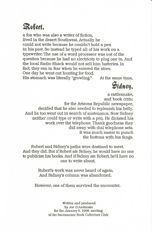
JD’A–K&S–12: Robert & Sidney
keepsake for Sacramento collectors club __/? – 1998
From A Memoir of Book Design:
This is another keepsake for the Sacramento Book Collectors Club. And again I stress the need we have for each other. In this case, I endeavor to show how important even our enemies are to our very existence. This work is meant to be a conundrum-one in which there is an allusion that there is a logical conclusion. And yet lawyers could argue both sides of the case and a jury could reach a verdict, but the result would remain a conjecture from circumstantial evidence.
I make the statement very personal and regional. For this reason, it actually sounds as if I were venting a grievance. And I suppose there is a trace of that hidden in the message, but this is merely a device to attract the reader's attention to gossip. Robert is a fox (literally) who is also a writer of fiction. Sidney is a snake (also literally) who is a book critic for the local newspaper, the Arizona Republic (actual newspaper in the Phoenix area. They are both hungry (literally-for food). And they both go out into the desert on the same day looking for sustenance. Even though adversaries, they need each other to advance their careers. The snake (the book critic) needs the fox (the author) or it would have no fodder for its column. And, the fox needs the snake or it would get no free publicity. One of them survives, but neither is ever heard from again. In fact, the piece does not even ask the reader to decide who ate whom. It merely states the case and then allows the reader to make his or her own decision about the next course of action. One of them obviously ate the other one, and since one of them is gone, the other disappears because the common need is gone. But they both could have become disgusted with the entire system and gone off together (not likely, however).
The entire text was generated on the computer and a plate was made from which to print letterpress. The first paragraph is a lighthearted description of Robert and it is justified (has an even margin) on the left side. The transition into the following paragraph, which belongs to a description of Sidney, is justified on the right and begins on the same line as the ending of the "Robert" paragraph. In order to make the transition from Robert to Sidney within the same line, the first word of the second description is heavily spaced from the last word in the first description. Thus the reader pauses only briefly before going on to the next description. The next paragraph is where the two beasts come together and it is centrally spaced, which means that both left and right margins are ragged. The same is true for the final paragraph, which induces the conundrum. The varying margins keep each section separate visually and thus allow the reader's mind to compartmentalize the information.
©Book Club of California
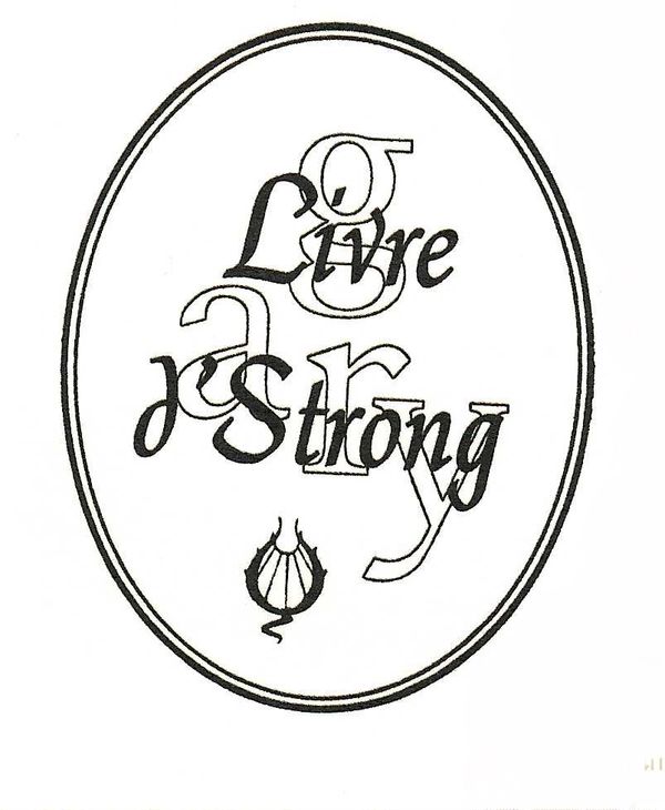
JD’A–K&S–13: Gary Strong Bookplate — 1999
From A Memoir of Book Design:
If I am going to do something different, I want it to be very different! There is absolutely no reason for me to waste my time continuing to do what has already been done. If I can't extend a particular design beyond itself into new realms of communication then it should be done by someone else. My purpose is to open new avenues of graphic design within the telling of a story and/or with letterforms themselves. No wonder I am sometimes perceived as being arrogant. However, that does not mean that I will design only to be different. And it does not mean that I will always design a totally new concept. Everything I do must show the viewer that the design has roots in another form. I try desperately to show the viewer the new form along with a hint of where the original form came from. If the viewer is not familiar with the old concept, then he or she has to accept the new until that day when the previous form is confronted and the light of recognition goes on in the viewer's mind.
Gary Strong asked me to design a bookplate for his private collection. At this point he had left the post of the California State Librarian and accepted a position in New York City as head of the Queens Borough Public Library System. Where once Gary was a national figure, he became a man of the world. He travels around the globe contributing his knowledge to enhance foreign library systems. Consequently, I wanted to give his aura an international flavor. In this case it is French by using the French for book and the French possessive: livre d’Strong. It is derived from "livre d'art" (book of art). That didn't seem to be enough. I needed to let the world know of this man's humble origins, because that is how they may judge how far he has gone. I did this in a subtle way with an outline (as opposed to bold black letters) of his first name, and more specifically by showing the letter "g" in lower case to keep it from being grandiose. And it does not intrude on the "strong" French flavor because it barely hovers in the background, seemingly softer in tone because it is an outline.
For the most part, this is computer generated-all except for the bug in the lower section of the ellipse. After I had positioned all of the letters in the oval, I felt it needed a little something more-something to give it an other than-rigid-computer look. I played with the letter "O" of Queens Borough Public Library System until it became a living breathing design element. It is something the world hasn't seen before. It is new. It is interesting. And it is intriguing. Happily, Gary approved. A plate was made and the bookplate was printed letterpress on archival paper.The reproduction above is the actual size.
©Book Club of California

JD’A–K&S–14: Popcorn Postcard
JD’A–K&S–11: Popcorn Postcard Announcement for exhibit of movable books __/1,100 – 1999
From A Memoir of Book Design:
The Book Club of California asked me to create an announcement postcard for an exhibition they were mounting. The exhibit concerned itself with the genre of pop-up books. All pop-up books are moveable books, but not all moveable books are pop-up books. And since the title of the exhibition was, "Moveable Books," I chose to suggest pop-up books by using the visual simulation of popped kernels: popcorn. It was meant to be cheerfully optimistic, especially since the time of the
exhibition was at the Yuletide holiday season.
Because the project was for The Book Club of California, which is noted for its attention to typographical details, I wanted the entire card to be letterpress printed. This meant that I could not rely on a photographically reproduced halftone for the popcorn images. Halftones do not letterpress well because the distances between the dots are so minuscule. It would have to be photographically reproduced from a line drawing into a metal plate for letterpress printing. Only then could the lines of the drawing be pressed into the paper. Rendering popcorn in a line drawing is extremely difficult. It looks like things other than what it truly is, e.g., a charwoman's hat. The image of popcorn really needs all the shadings associated with a halftone to clearly define its many bulbous parts. It took some delightful microwave popcorn sessions with the models posing before being devoured, but I was finally pleased with my line drawings.
The next step was to create the illusion of depth by printing various segments of the announcement in different shades of gray. If one looks off into the distance, one may note that minute particles in the open air dim the brightness of colors as one's eyesight reaches the horizon. The eye automatically associates the visual concurrence to that of distance. The headline was printed in black, the popcorn in gray, and the data in a lighter gray. That meant three printings for one side of the card, and two more, light gray and dark gray, for the reverse. That is a total of five printings for each card. And since the number of postcards needed was 1,100, that meant that the press would have to be hand cranked 5,500 times, not including extras for errors. The reproduction above is seventy-five per cent of its actual size.
©Book Club of California

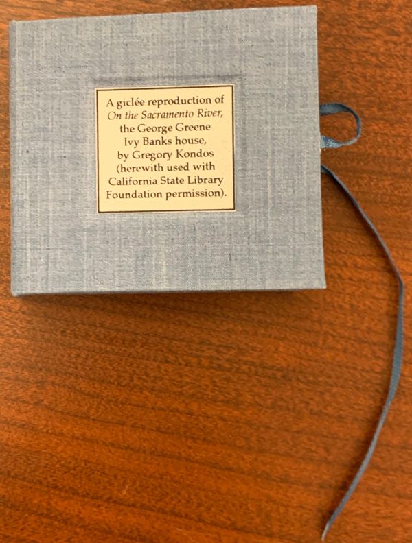
JD’A–K&S–15A: On the Sacramento River
Prototype of Keepsake for the SBBC, 2004
at California State Library
Small book with giclée reproduction of On the Sacramento River, the George Greene Ivy Banks house, by Gregory Kondos
Information on white labels and differs from final version
Blue cloth boards
3 x 2 1/4 inches
Courtesy of the California History Room, California State Library, Sacramento, California
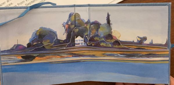
JD’A–K&S–15B: On the Sacramento River
Keepsake for the Sacramento Book Collectors Club 65th Anniversary Meeting February 13, 2004. Small book with giclée reproduction of On the Sacramento River, the George Greene Ivy Banks house, by Gregory Kondos __/? – 2004
front

JD’A–K&S–15B: On the Sacramento River
Keepsake for the SBBC, 2004
back
JD’A–K&S–15B: On the Sacramento River
Keepsake for the SBBC, 2004
inside

JD’A–K&S–16B: SBCC 65th Anniversary broadside
Sacramento Book Collectors Club 65th Anniversary Keepsake broadside for the meeting February 13, 2004. 11 x 17 inches includes Sierra Jewels (JD’A–K&S–9) and a reference to a slide show that will be given by D’Ambrosio about A Memoir of Book Design. This was printed by Robert Dickover and Vincent Lozito.
Courtesy of the California History Room, California State Library, Sacramento, California
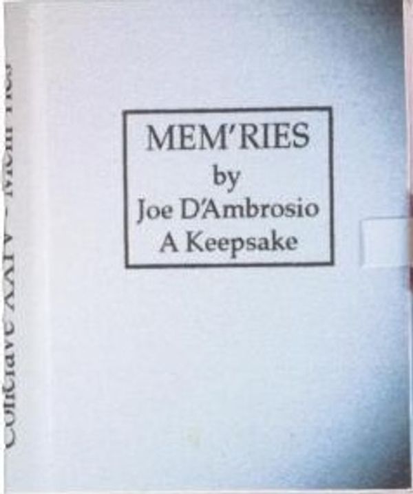
JD’A–K&S–17: Mem'ries: A Keepsake
. featuring portraits of 4 conclave members __/? – 2006
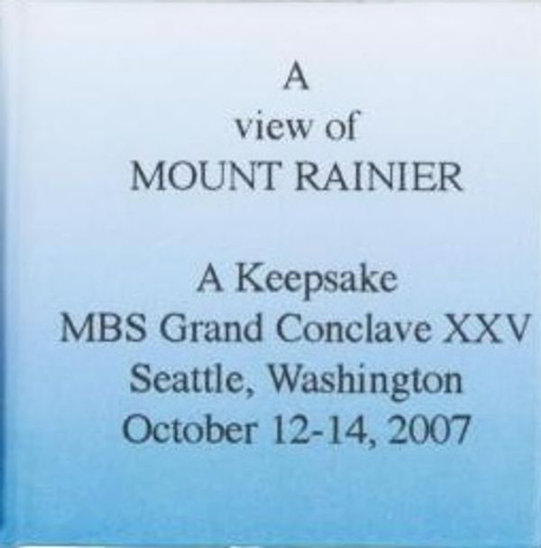
JD’A–K&S–18: A View of Mount Rainier
JD’A–K&S–17: A View of Mount Rainier: A Keepsake for SBCC __/? – 2007
JD’A–K&S–19: James Lorson 1928-2008 (I remember Jim) (boy bookseller) – 2008

James Lorson
1928 - 2008
To Jim,
my partner in life and in business, who in my heart will always be the "boy bookseller."
—Joan Lorson
Beloved bookseller Jim Lorson passed away on November 3, 2008 from a heart-related illness that took him by surprise, and thankfully offered little suffering. Jim was a quiet, simple man who loved books from the time he was five years old, and thoroughly enjoyed helping others to find just what they were looking for. It takes a special touch to share knowledge, to be genuinely helpful, and to
do so without offending or diminishing someone. Jim could do that. Along with a pleasant and edgy sense of humor, he called things as he saw them, even when it was not a popular thing to do. He had a fine eye for the beautifully produced book, and that went far beyond accepted standards. He also published many fine press books. Jim will be missed not only by his wife, Joan, their two daughters and three granddaughters, but by the many individuals he personally touched over the years in their California book shop. He was a member of The Zamorano Club, Los Compadres, The Book Collectors of Southern California, and put together many important book collections.


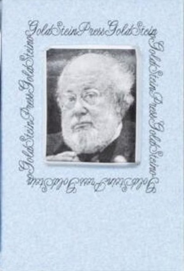
JD’A–K&S–20: Leonard Goldstein
JD’A–K&S–18: Leonard Goldstein 1931-2008: A Keepsake __/? – 2008

JD’A–K&S–21: UCLA Library Gary E. and Carolyn J. Strong Endowment for the University Librarian – 2008
UCLA Library — Gary E. and Carolyn J. Strong Endowment for the University Librarian bookplate
JD’A–DVD–1: I can't fly DVD ballet [see JD’A 49] – 2005

JD’A–DVD–2: Text for Through a Glass DVD see JD’A 51—2006


JD’A–CD–1: Ballet music for Oaxaca [JD’A53] – 2007

JD’A–CD–2 Words and music: fantasy tales [JD’A 54] – 2007

Courtesy of the California History Room, California State Library, Sacramento, California
JD’A–CD–3 Emily & Oscar in book [JD’A 11c] – 2007

JD’A–CD–4 Music by Joe D’Ambrosio – 2007
CD insert into Artists’ Books Reviews #27 – 2007
