- Home
- Books
- Bindings, Cases and Boxes
- ART, POSTERS & BROADSIDES
- Keepsakes,DVDs,CDs, video
- Christmas & Holiday Cards
- ephemera
- Joe — on , about, with
- Artists' Books Reviews
- You Dress Funny
- Krome
- ANAKED, one – 1972
- ZARATHUSTRA – 1973
- ANAMORPHOSIS OF EVE
- THE ONDT&THE GRACEHOPPER
- TRAPEZE — 1976
- A CHECKLIST — 1977
- THE MOOKSE & THE GRIPES
- Literary Figures
- EMILY AND OSCAR
- THE CRUSADER
- THE LITTLE SAND CRAB
- DAISIES NEVER TELL
- BIRDS IN PARADISE
- Books 1985–1988
- The Small Garden of GS
- Books 1989–1993
- Books 1994 – 1995
- Books 1996 to 1999
- Books 2000– 2005
- Books 2006–2008
- Wants, Thanks and Notes
JD’A 43: Jen and Josh – 2000

From A Memoir of Book Design
©Book Club of California
JD’A 44–P: Martha on Copper Mountain prospectus 2000

JD’A 44: Martha on Copper Mountain — 2000
Top

Title

preface
text and art

text and art
text and art
text and art

art
text and art
Martha

Martha
text and art
Martha

JD’A 45: America, My Wilderness — 2002


AMERICA, | MY WILDERNESS | by | Frederic Prokosch
2 x 2 3/4 inches, [title on front board], [1–2]: Six stanzas of poem: As I lay in the solemn cool transparency of night; [popup of 4 primarily purple butterflies], [colophon on back board].
Colophon:
Reprinted from the novel of the same name by Frederic Prokosch (1906-1989), himself an amateur. lepidopterist.
Fifty copies designed & produced by Joe D'Ambrosio for Lorson’s Books & Prints Fullerton, CA 2002
[Signature D’Ambrosio in pencil]
Binding: speckled green paper with cloth spine that wraps 1/2 inch around front and back boards. Green paper on spine printed: AMERICA, MY WILDERNESS – Prokosch.
2 1/8 x 3 x 3/8 inch slipcase of dark green paper with notch.
Note: A copy was seen with a pointed spine and no label on the spine.
ANNOUNCENT:
Joe D'Ambrosio has recently completed a 50-copy limited edition miniature book for Lorson's Books in Fullerton, California. The title is America, My Wilderness, and it consists of a poem by Frederic Prokosch from his novel of the same name. The book is presented in a cutaway slipcase for easier retrieval. Since Prokosch was an amateur lepidopterist, the covers of the book open to reveal the poem surrounding four pop-up butterflies. The stanzas of the poem can be read in sequence or they can be appreciated in random order while still conveying the same meaning. The America that Prokosch illuminates is a country after the civil war but before the industrial revolution when this vast area was yet agrarian and rural.
The book is priced at $35 plus shipping and those who would like a copy may contact the Lorsons at 141 W. Wilshire Ave., #D, Fullerton, CA 92832 - Telephone: 714-526-2523 (or) lorson@earthlink.net.
JD’A 46—P: La Famiglia by Sheila Ponterini — Prospectus

La Famiglia
by Sheila Ponterini with a preamble by
Joe D'Ambrosio
Possibly the world's largest miniature book—
new from Joe D'Ambrosio, 2002

EDITION: 50 Copies (signed and numbered)
BOOK SIZE: 2.875" high x 2.875" wide × 2.375" deep
PRICE: $396.00 each
Due to the difficult nature of this construction, copies may not be readily available—a waiting list will be used to facilitate distribution. Please do not send payment at this time.
Merely state your preference if you wish to reserve a copy.
Joe D'Ambrosio

La Familia is a miniature book of five boxes preceded by twenty-four pages of text. The text outlines the general communication and the depth of the boxes highlight those thoughts by using visual collages to further enhance the emotional impact. The boxes (made of archival board) and the pages are first glued and then sewn to brass rods which keep the entire structure intact. The book is presented in a sculptural slipcase.
The paper for the text is Arches text wove and the type used is a digital version of Hoefler Text for the preamble and New Berolina for Sheila Ponterini's diary. Metal plates were made from a digital printout and the type was then letterpress printed with black ink on a Vandercook No.4 hand printing press.
The collages within the boxes are composed of many objects and papers. The use of crumpled colored papers are once again used to convey shape and texture.
La Familia, because it addresses within the same scope the subject of abortion and the use of the death penalty to deter crime, may not appeal to everyone. While the book is not a manifesto on the subjects, to allow the viewer to see another aspect of the controversy, it does bring up a new attitude toward them which may not be to everyone's liking even if one is for, or against, the basic premise. Also, one box contains a cast paper nude image of a hermaphrodite, and another box contains a cast paper nude image of a pregnant woman with an aura around her head. The visual depiction of an early woodcut showing Adam and Eve in their garden is presented as is—sans fig leaves.
JD’A 46: La Famiglia by Sheila Ponterini — 2002


JD’A 47: James Lorson Boy Bookseller at 75– 2003


JD’A 48: Mr. & Mrs. Potato –2003
JD’A 48–P: Mr. & Mrs. Potato prospectus

ANNOUNCING
A Madcap New Miniature Book from the zany side of Joe D'Ambrosio
Mr. & Mrs. Potato
A delightful and whimsical romp about the love affair between two potatoes who have "eyes" for each other. The text is printed in dark brown Hoefler Text on tan-colored Confetti paper and includes separately glued-in reproductions of four original anthropomorphic potato illustrations. The pages are quarter bound in mashed potatoes (cotton linters) and gravy (brown leather), and presented in a chemise (to protect the
"mashed potatoes") that is itself nestled in a protective slipcase.
50 copies - $65 each (including shipping).


JD’A 49A: I CAN’T FLY – 2004
left
center
center

center
center
center

right
center
right

1
right

2

3

4
4
4

5
4
4

6
4
6

7
box opened
6

A ballet in one act written and choreographed by Joe D'Ambrosio
©2004
Suggested performance to Capriccio for Oboe and Orchestra (piano) by Amilcare Ponchielli (1834–1886)
Starkota, a goldfinch, emerges from her egg along with her brother and sister chicks. Mother and father nurse them and encourage each to spread their wings and fly. Eventually they all do-all but Starkota, who remains in the nest. She not only lacks confidence but is also very secure to have mother and father take care of her. Soon the parents abandon the nest and Starkota with it their job done. Starkota is left unprepared, and after a frightening electrical storm, Ells with the nest onto a cushioning shrub. She peers into the night and those fares that await her. Dawn emerges to find Starkota foraging on the forest floor oblivious to the dangers present. After a while she spots Kaiko, a male bird of her species, and decides that it is opportune to encourage mating. That course of action will provide the protection and guidance that she needs Kaiko is bewildered and confused that she cannot fly, and soon abandons her because of it. Nightfall finds Starkota alone and frightened. She hides in a thicket, but soon two hungry eyes materialize behind her. Yoko, a tiger cat, is looking for its dinner. She chirps loudly in panic and flaps her wings as he attacks. The stage goes black amid her screams.
When the lights come up the stage is empty Kaiko returns looking for her. He doesn't find her and flies off into the emerging dawn.
box
box opened
box opened

I Can’t Fly. Finus
AP
Half Circle Book
6 3/4 inch diameter
8 wedges, each, 2 /1 inches high
Box with green cloth and decorative silver. Recessed 4 3/4 x 1 inch
white paper on spine I CAN’T FLY
box opened
box opened
box opened

From letter to Gary Strong, 7-24-06
Herewith, the original "I Can't Fly." I think you will enjoy it.
Opening the clam-shell box and removing the book-of-boxes is apparently matter-of-fact.
However, opening each of the boxes is another matter. They are interlocked together so that they won't easily fall open by themselves. Trying to force them open would damage the locking mechanism. As you hold the book in front of you (looking straight at the end of each box) you would have your left hand on the first box and your right hand on the adjoining second box. Keep your left hand steady and gently lift the box in your right hand. It should unhook and open easily. Do the same with each set of boxes, and close (rehook) the previous set once you move on to the next set. If you have any questions, my telephone number is above.
By the way, the silver on the clam-shell box is real silver. It is Japanese silver tea-chest paper over archival board. The Japanese coat the thin layer of silver with a glaze to keep it from oxidizing. Then the board with the silver covering is inlaid into another archival board to keep their surfaces at the same level. Let me know how you like it.
JD’A 49B: I CAN’T FLY – 2005
title
dedication
copyright

copyright
dedication
copyright

dedication
dedication
dedication

colophon
announcement
dedication

announcement
announcement
announcement

Joe D’Ambrosio announces his first experiment with the DVD as a book medium. I Can't Fly Edition: 150 copies Price: $85 each (includes shipping) joebooks@cox.net
Note: Do not order this if you do not have access to a personal computer that can play a DVD. Viewing it on a household TV will be a disappointment. Is it a book, or is it a silent movie with a sound track?
CD
announcement
announcement
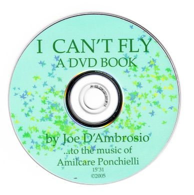
I Can't Fly | A DVD BOOK BALLET | by Joe D’Ambrosio | ...to the music of | Capriccio for oboe and orchestra | by Amilcare Ponchielli | 2005
5 x 5 1/2 inches, gray-green endpaper that extends to front cover, [1–2]: blank, [3]: Dedicated to | The Book Club of California, [4]: blank, [5]: title page, [6]: © 2005 Joe D’Ambrosio, [7]: text, [8]: blank, [9–12]: text:, [13]: sleve to hold DVD, [14]: blank, [15]: colophon, [16]: blank, gray-green endpaper that extends to back cover.
Colophon: This DVD book | was generated on an iMac | with a G5 processor | using Photoshop and Flash MX software, | and the iMovie and iDVD, | and GarageBand platforms, | where the music from the CD, | Capriccio Digital 10 281, | Delta Music GmbH, Germany; | Burkhard Glaetzner, oboe soloist; | Berliner Sinfonie-Orchester, | Claus Peter Flor, conductor, | was edited. | This first edition | is limited to 150 copies. |
[signature in pencil] Joe D'Ambrosio
5 1/2 x 5 7/8 inch boards with cream paper covered with leaves and stems, dark green cloth spine that extends 1 1/2 inches around front and back, spine with 1/4 x 2 inch paper that has in black: I CAN’T FLY – Joe D’Ambrosio.
JD’A 50: The Diamond Wager – 2005


JD’A 51: Lunch at Alberts – 2005


Lunch at Albert's:
Reflections on Joe D'Ambrosio's
A Memoir of Book Design
by Adela Spindler Roatcap
IT’S BEEN OVER TWENTY YEARS since Steve Corey invited me to lunch at Albert Sperisen’s place on Twnty-ninth Avenue. “You’ll like him,” Steve; "he knows everything there is to know about books." It was at Albert's that I first saw the work of Joe D'Ambrosio. Now, while holding in my hands a copy of Joe's A Memoir of Book Design: 1969- 2000, I can only imagine how pleased Albert would have been with this handsome book. It's the Book Club of California's 216th publication. It was written by Joe D'Ambrosio, designed and printed to his specification, with attractively lettered endpapers, front cover quarter-bound in blue-gray paper patterned with his "baby birds with open beaks." There's an introduction, a chronologically arranged description of all his books, decorative bindings, and lettering projects. There are over one hundred and seventy illustrations, almost all in color. There's a list of posters, prints, and broadsides. I'm drawn into reading further by the earnestness of Joe's autobiographical narrative. Our protagonist, like Dorothy in the Land of Oz, struggles to find his way to the land of artist's books.
Joe D'Ambrosio was born in Chicago during the waning days of the Great Depression. Early on he discovered music, or rather he found that just by flexing one of his little fingers he could make a sound on the upright piano in his grandparents' parlor-or that "a physical movement by me could produce a response in a separate object." Powerful insight. Would Santa bring him a piano? As Joe was one of six siblings, the devotedly prayed-for instrument did not materialize. "I have never really believed in Santa Claus, or in receiving something for nothing," our hero tells us. His disappointment brought about a life-long attitude of "I can do it by myself," as reflected in his artistic credo:
An artist's book may be done as a collaboration to satisfy the pundits. Even so, when it is done by more than one artist, it ceases to be a unified vision of a specific subject. And only through experimenting within a given field can one expand to create new areas of expression. Does a painter share a canvas with another painter?
Lunch at Albert’s: | Reflections | on | Joe D’Ambrosio's | A Memoir of Book Design | [slice of pie] | by | Adela Spindler Roatcap
2 x 2.5 inches, gray endpaper, [i–ii]: blank, [iii]: A KEEPSAKE…, [iv]: blank, [v]: title page, [vi]: copyright, [vii]: title, [viii]: photo of Albert, 1: text with image, 2–4: text, 5–6: black and red text, 7–10: black text, 11–14: black and red text, 15–17: black text, 18: image of rotunda floor, 19: photo of joe and text, 20–30: text 31: black and red text, 32: red text, 33: red and black text, 34–40: black text, [41]: colophon, [42]: blank.
Colophon: This edition of Lunch at Albert"s
by Dr. Adela Spindler Roatcap has been designed and produced
by Joe D'Ambrosio with digital Hoefler Text
and ink-jet printed (giclée) on Somerset Book paper with an Epson Stylus 1160
and bound in an edition of fifty numbered copies and ten artist proofs.
February 2005. [in pencil] #/50
Binding: Black cloth with multicolored stars that wraps around front covering a picture of Joe D’Ambrosio, [in white over picture]: Joe D’Ambrosio, on spine on gray paper in frame: Lunch at Albert’s Roatcap. Inside flap [signature D’Ambrosio ’05].